15 web design terms and definitions
1. Visual weight
Visual weight is a theory according to which each page has its own weight, of course, in a figurative sense. But the term is very popular, and it opens our list.
2. Density
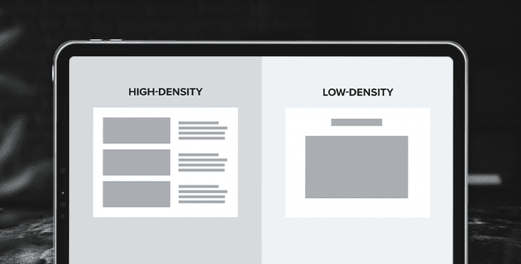
Density is the amount of information and visuals in a particular area, page, or design.

High-density pages are sometimes visually described as "loaded" or "crowded". Low-density pages are considered light pages with lots of white space.
3. Pattern
A template is a pre-designed and usually unique layout for a page or pages on a website. It is applied to page content for design purposes. For example, the home page and contact page have different content, user interface elements, and functionality. They require different layouts and therefore different page templates.
4. "Over the fold"
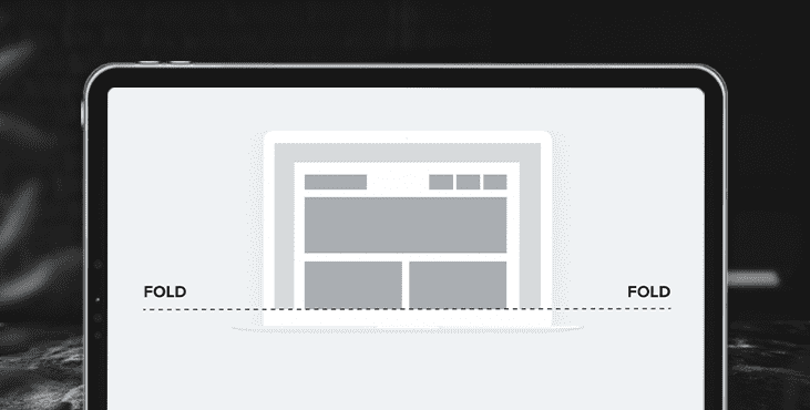
This refers to content that the user sees for the first time on the page without having to scroll. This is a little tricky to implement in today's web design because people access websites from different devices with different screen sizes.

5. Responsive web design
Responsive web design allows your website to automatically adapt to any screen size (desktop, tablet, and mobile) for a seamless user experience.
6. Empty space (or negative space)
This is the empty space between and around UI elements, columns, fields, images, and text. Keep in mind that the white space doesn't have to be white, it can be any color. White space is often used to improve the readability of text, create balance, and as a separator between unrelated elements in a design.
7. Minimalism
Minimalism is a style in which the design is stripped of all unnecessary elements, colors, and content that does not support the user's goals. When done right, a minimalist design is clean, crisp, and functional.
8. Balance
Balance is the visual weight of all elements in a composition. We use balance to create structure and alignment.
9. Composition
It refers to the arrangement of design elements on the page. A successful composition should captivate and guide the user through the content.
10. Scale
Scale is the size of an element in relation to another element. Scale can be used to arouse interest and capture the user's attention.
11. CTA (or call to action)
CTA is the part of the page that encourages the user to take action. For example, on a product page, you might see a big button that says "Try it for free" - this web design term is called a call to action. Good calls to action stand out on the page and use text that encourages the user to interact.
12. Information architecture
Information architecture is the process of organizing the pages, content, and navigation of a website in the most logical and useful way. The result is usually a sitemap. The goal is to allow users to find everything they need without extra effort.
13. Wireframes
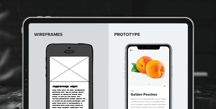
Wireframes are low-fidelity sketches that describe page structure, navigation, key features, and content without including any design elements such as fonts, colors, or images. Wireframes are used for brainstorming, charting user journeys, and quickly illustrating interactions. Wireframes are a great way to start the web design process because they save time and make it easy to spot usability issues.

14. Prototype
Often confused with a wireframe, the prototype is a medium-to-high representation of the final design. Prototypes are interactive and functional and allow website owners to effectively use the final design before it goes into development.
15. Style guide
A style guide is a document that includes all brand colors, typography, and other design and user interface elements of a website. The style guide is used to maintain a consistent look and feel across all media channels and can serve as a guide for any future additions.
Get a creative brand asset as a bonus
Tell us what you think
By clicking 'Submit', you agree to Privacy Policy and authorise our staff to contact you. You are liable under the Personal Data Protection Act if you key in false personal data or other people’s personal data.
offers and news
