

5 examples of bad website design: what their creators got wrong
The internet has come a long way in web design since the 90s. Do you remember Apple in 1998 or Amazon in 1999? Web design has improved a lot over the past decades, but there are good and bad websites on the web today. By good and bad we don't mean something subjective, like beautiful and ugly. A good website is user oriented. It allows people to easily navigate within themselves, find answers or take actions like shopping. A bad website is not user friendly. This could mean it's cluttered, hard to view, has accessibility issues, or something else.
We'll cover what makes a website bad and look at a few examples so you can avoid these mistakes in your own design.
What makes a website design bad?
Cluttered layout, hidden navigation menu, lack of color contrast, non-responsive design, and incompatible fonts are just a few characteristics that can ruin a site's design. A hallmark of poor website design is a lack of user focus.
Website engagement metrics are average time on page and bounce rate, they can give you insight into your site's user orientation. They will tell you where your visitors usually go on your website, how much time they spend there, how often and how they get to your website. User testing will also help you gather useful information and make changes based on what you've learned. This can be done using special services.
5 Examples of bad website design
The Room
What's wrong: lack of trust The website is one very long homepage. It does not have a navigation menu to make it easier to browse or navigate to a specific section. The items below the image shown look like navigation items, but if you click on any of them, they open a new tab. So, your only choice is to exit the site or scroll down the page. As you scroll, you'll see a lot of images, GIFs, and hard-to-read text.

ZARA
What's wrong: unconventional navigation Visiting the ZARA website is like leafing through a fashion editorial magazine, which is cool but makes shopping difficult. The user path on the ZARA mobile site is also difficult. Clicking on the hamburger menu on a mobile phone opens an unconventional navigation menu. Users won't find any breadcrumbs or sorting options to help them browse.

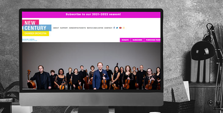
New Century Chamber Orchestra
What's wrong: inconsistent branding The New Century Chamber Orchestra has a stunning tri-color logo of pink, blue and yellow. These colors are used throughout the site, but in different shades. For example, the headers, the signup form, and the footer on the homepage all have different shades of blue and none of them match the blue in the logo. The site has CTA buttons in neon pink, yellow, and blue. Some of these choices seem inconsistent and unintended, which can harm the user experience and weaken the brand identity.
Wayfair
What's wrong: no visual hierarchy. The Wayfair homepage can also paralyze users as there is too much on it and a person can get confused. The main problem is the lack of visual hierarchy.
Visual hierarchy is a way of arranging and organizing site elements in such a way that visitors naturally gravitate towards the most important elements first. The goal is to encourage visitors to take the desired action.
On the Wayfair homepage, almost all elements are the same size and color, and have similar copies and icons. It is difficult for the user to choose and focus.

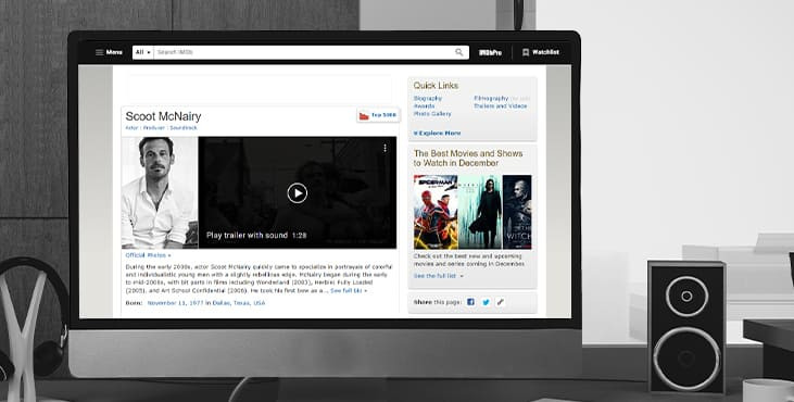
IMDB
What's wrong: messy layout IMDB has redesigned many of its web pages, such as the home page, for a better user experience. But some of its pages still have an outdated design that has a number of UX flaws. With few spaces and colors, relatively small font, lots of ads and other content, the layout is cluttered and doesn't allow visitors to reach their goal easily.
Get a creative brand asset as a bonus
Tell us what you think
By clicking 'Submit', you agree to Privacy Policy and authorise our staff to contact you. You are liable under the Personal Data Protection Act if you key in false personal data or other people’s personal data.
offers and news