6 types of web design for your website
Ready to build your website but not sure which web design format is best? Here are six of the most common web design layouts for your business, along with the pros and cons of each one.
1. Static page layout
One of the most basic types of website design is the static page layout. With this layout, you create a website with predefined page dimensions and it has a constant width. Static layouts adhere to these sizes regardless of browser or device type.
Static layouts have gradually disappeared with the rise of mobile usage. Since these sites are not device responsive, they do not provide a positive user experience on smartphones or tablets. While static layouts are still possible, you generally don't want to use them unless you're building a completely separate mobile version of your site.
Advantages of static page layout:
- Easy to set up.
Disadvantages of static page layout:
- Not responding to devices or browsers;
- Requires creation of a separate mobile site (additional work).
2. Fluid design layout
Next on this list of web design types are liquid design layouts. This layout, also known as flex design, uses flexible units rather than static fixed unit layouts. Since the units are flexible, the page will always take up the full width of the device's screen, no matter what device it is.
Since user interaction is critical to attracting and driving traffic to your website, liquid layouts have also begun to be phased out as a viable option for businesses. While you can still use this layout, you run the risk of delivering an unsatisfactory experience to users from your site by being too stretched or by compressing the information on the page.
Pros of liquid layout design:
- Easier to customize than responsive design;
- Information is not cut off on pages.
Cons of liquid design layout:
- If the browser is really wide, the information stretches to fit the screen and may look unattractive.
- If the browser is smaller, the information is merged together to fit on the screen, making it difficult to read and view.
3. Responsive website design
One of the web design formats that you can use for your site is responsive. As the name suggests, this website uses CSS requests to adjust the size of the website to determine the size of the browser. Responsive websites automatically change the layout of a website to provide the best experience for visitors.
Responsive website layouts have preset options to customize your website. For example, a setting might look like this: If the browser is 500px wide, set the main content container to 400px wide.
For example, if you have a website with a two-column layout, the responsive layout will change to a single-column design on a small browser screen.
Advantages of a responsive website layout:
- Easy to set up;
- Takes less development time than responsive layouts;
- You can adjust your site according to the size of the browser.
Disadvantages of responsive site layout:
- The device width between the given values can cause your site to have too much or not enough space.
- Not fully responsive
4. Dynamic website layout
When you look at the list of web design types, you will see that dynamic website layout is an option. Dynamic website layouts are great for people who don't have extensive knowledge of HTML. These websites may provide visitors with different content, even if two different people are viewing the same page.
Using a dynamic website layout, you create a database of information and features. Then, when a user requests a page, web coding automatically combines the components from your database to form a web page.
Advantages of dynamic site layout:
- Interactivity with users;
- Increased functionality for users;
- Less programming skills required;
Disadvantages of dynamic site layout:
- Can be harder to set up with different features;
- Load slower due to different elements and page compositions.
Next 5. Responsive design layouton our list of website layout types is the responsive design layout. This layout format is the most popular because it fits all devices on your site and fills the browser size perfectly.
Responsive design takes a mobile-centric approach. First you create your mobile layout and then you expand your website for a larger browser size. So instead of trying to trim down your website and make it smaller, you start small and grow.
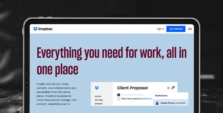
You can see a great example of responsive design from Dropbox. Here's what their site looks like in a large desktop browser:

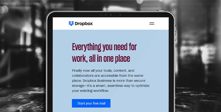
When you view it on a mobile phone, the entire site adjusts to fit the size of the mobile browser, providing a seamless user experience.

Pros of Responsive Design:
- Get a website built for mobile users;
- Ensures smooth operation on all devices;
- No need to create a separate mobile site;
Cons of responsive design:
- More time needed to create and develop;
6. Single page layout
The last element we'll look at in our list of web design types is the single page layout. As the name suggests, single page layouts only use one page that users scroll down to find information about your products or services.
Advantages of a one-page layout:
- Easy to create;
- Helps you create a clean and simple website.
Disadvantages of single page layout:
- Cannot be used for companies that sell products online;
- Cannot be used for companies that require multiple pages;
- Can turn people off if one page is too long and requires too much scrolling.
Get a creative brand asset as a bonus
Tell us what you think
By clicking 'Submit', you agree to Privacy Policy and authorise our staff to contact you. You are liable under the Personal Data Protection Act if you key in false personal data or other people’s personal data.
offers and news
