8 tips for creating an effective hero image for a website
They say it only takes 2-3 seconds for a user to understand if he likes this website and will continue scrolling it or leave. Web developers and designers have very little time to make a good impression on a person when they visit a resource. That is why it is so important to properly design the main page and a website header, which the visitors see first of all.
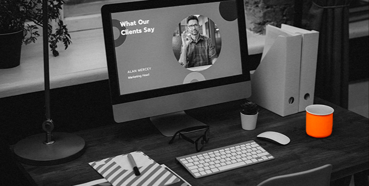
Many online projects use a common way to attract the attention of the audience - the use of bright colorful designs, in particular - placing a background image or a banner of large size at the top of the website. It is also called the "hero image".
This "main image" is not just a pretty illustration on the site to grab attention, it must become something more. Developers should try to make a powerful visual communication tool that can increase sales and become a real "hero" of your online business.
In my article I sare 8 useful tips to help create the right hero image - one that will attract attention, help convert users into loyal customers and be a useful addition to your website design.
1. Use relevant pictures
This is one of the key points. Suitable quality graphics will help to increase the overall rating of the site, while the wrong illustration risks spoiling the whole impression of the design.
While placing the hero image, mind choosing the pictures that match the design, content and website idea. If the hero image and content will be uncoordinated this will perplex the user and push to leave the site.
Stock pictures on the homepage are already a cliché. There is nothing wrong with them, but if you really want to quickly acquaint users with the main idea of your site, or you want to stand out from other similar companies, then you should avoid this approach. Stock pictures are mostly irrelevant and do not arouse much interest among users.
2. Turn your hero image into a piece of art
Design is the same content, which is presented in the form of images. It helps the visitor focus on the informational content of a web page.
A thoroughly designed hero image banner will definitely catch the eye and grab the attention of the users.
Tip: the main image should emphasize only the key points but not to contain overall information.
3. Emotions are the key
According to surveys, 70% of customer loyalty and the decisions to buy are based on emotions. If your graphic banner is endowed with personality and subject matter, then it is sure to cause a response from visitors. Expressive, inspiring images turn an inanimate product or corporation into something that can evoke normal human feelings.
Effective web design that reflects emotion is created for people but not for metrics, algorithms or SEO robots. And this rule works in all the cases: for products, large companies or individual entrepreneurs.
Emotional connection with your audience is a great way to elicit a positive user experience that helps build consumer loyalty and brand trust.
4. High quality graphics
Pictures should not be blurry or retouched. If the pictures are of poor quality the users will have difficulties in understanding what is depicted in them. The use of such options in web design indicates a lack of professionalism. A hero image banner is the face of your brand, so try to avoid using "pixelated" images (unless they're pixel art).
Tip: If you don't want the images to look blurry, the best way is to use vector graphics editors like Adobe Illustrator and others when designing your site.
5. Add CTA elements to improve conversion rate
The most common place for call to action (CTA) is the top of the large image at the top of the screen. It is very important to achieve visual harmony between the image, content and CTA-button, especially if you are developing a landing page.
When content is placed on top of a picture, web designers usually adjust its contrast or brightness. This is to ensure that the text/button is clearly visible.
6. Use contrasts
One of our main goals is to gain the attention of visitors. The famous example with iPod ad where the designers used contrast to draw the audience's attention to the audio player. The dark silhouette and white headphones stand out clearly against the light green background.
7. Adjust the image to the different screen sizes
Make sure the picture is the right size for any device's screen size. Adapt the picture for different platforms, if you have to resize it, do it.
Tip: Use tools that allow you to adjust the size of images. For example, Cloudinary, a cloud-based web project that allows you to track the control points of a picture interactively.
8. Let your creative imagination run wild
Creative illustrations and drawn web designs are becoming a global trend now and easily replace standard simple hero image banners. They offer designers some advantages over "traditional" pictures as they provide more opportunities to convey information about different abstract concepts that are difficult to capture in a single frame.
They're easier to tailor to a specific brand - it helps to strongly connect your company philosophy that makes it unique, the services you provide, and even your team in a single image.
Tip: If you're posting multiple illustrations, make sure they work in harmony with each other - as if they were drawn by the same artist.
Tell us what you think
By clicking 'Submit', you agree to Privacy Policy and authorise our staff to contact you. You are liable under the Personal Data Protection Act if you key in false personal data or other people’s personal data.
offers and news
