

Basic rules for concise Instagram design
Instagram is filled with flashy ad creatives and profiles with overloaded post designs. All accounts struggle to attract the attention of the user, so the visuals of publications contain bright colors, large inscriptions, and catchy graphic elements. Today there is so much of this in the feed that in order to stand out from the flow of colors and the mix of design solutions, on the contrary, you need to look concise. In this article, we will share the basic rules of calm design.
Minimum visual noise

A few years ago, it was a trend to use a bunch of effects on one image, and many profiles still adhere to this vector. This is not only about photo processing, but inappropriate compositional decisions in design. People blurred elements of photos, applied noises and filters with textures, and retouched faces.
Today, the audience is for frankness and a minimum of changes. Users are tired of perfect photos and tons of presets. Do not overload the image with effects and various details. Instagram can lower the quality of the photo and then all the details will turn into a pixel mess. It is better to spend energy on another aspect from the next paragraph.
Thoughtful photo composition
We are not only talking about flatlays, where you need to lay out everything beautifully on the table. Composition in photography is a fundamental aspect of creating a beautiful photo. Often, for content in social networks, photographs are taken initially for future processing in editors.
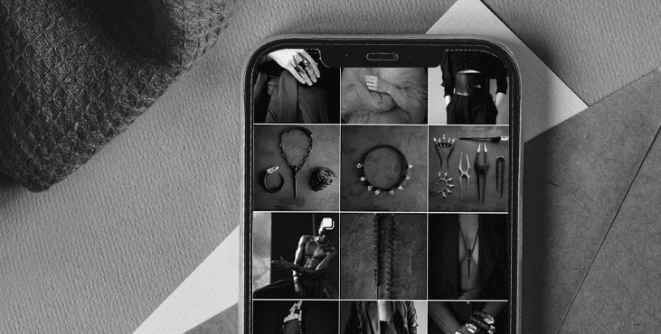
If everything is difficult with composing, then just take a picture of the product or model on a plain background. It will already look attractive. And then, over time, learn to make more complex combinations. But it’s also not worth going into very complex compositions either. A simple compilation of different textures, colors or distance from the camera is enough.
Alternating post types
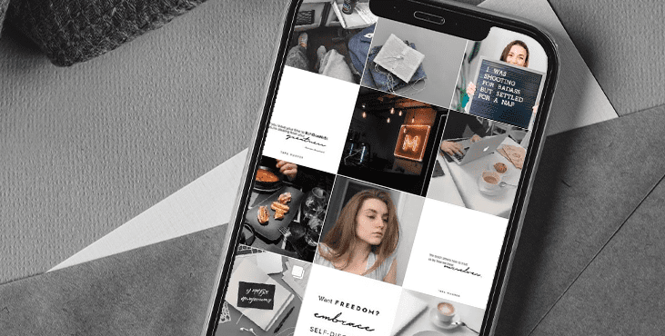
Not everyone can take enough photos to use them for all posts and not be repeated. In this case, alternating photos with text images will help. For example, you can place the title or key idea of the publication on them. The main thing is to use matching colors so that your entire profile does not look like a multi-colored chessboard.
Soothing colors
As for colors, it is advisable to use them in pastel shades or muffle bright colors. This is what will set you apart from the many acid photos. The visual will look stylish and discreet. In all the examples from the article, the profiles almost do not use bright colors that catch the eye of the user. The audience is already annoyed by such methods of attracting attention and tries to scroll through them faster in their feed.
Unobtrusive graphic elements
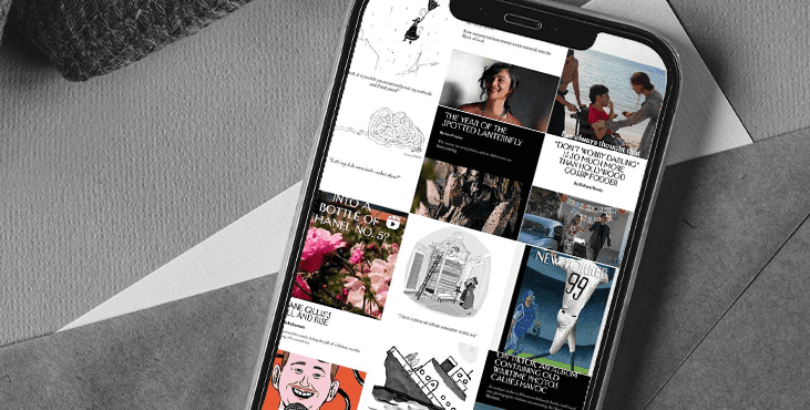
The laconic design is good because it is used solely for the transmission of information. It has very few elements that are in the image just like that. Here you will not find different fragments from photo stocks or inappropriate collages with illustrations. Each element either emphasizes the necessary information or unobtrusively illustrates the text.
Conclusion
The laconic design looks simple, but at first it will seem that something is missing in the visual. Take the examples from this article as references or look for something similar in search engines so that you have something to build on.
Get an audit of your social media account as a bonus
Tell us what you think
By clicking 'Submit', you agree to Privacy Policy and authorise our staff to contact you. You are liable under the Personal Data Protection Act if you key in false personal data or other people’s personal data.
offers and news