Dark on light or light on dark?
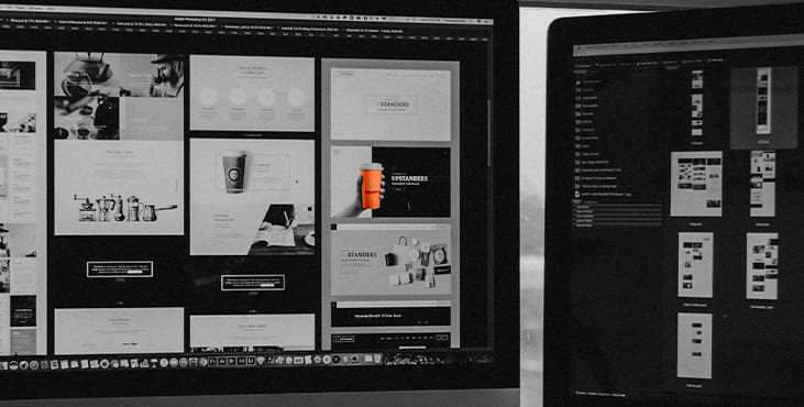
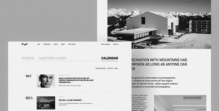
One of the first questions designers usually have to answer in terms of color and contrast is what overall color scheme to choose from: dark on light or light on dark? From this point of view, several important aspects should be taken into account.
Clarity:
This aspect should include the user's ability to clearly see and distinguish all relevant details on a screen or page. The color scheme and combinations should support simple and intuitive navigation and effectively highlight the most functional elements of the layout. When this aspect is not considered and tested properly, it can lead to products creating a complete screen clutter that users do not see what they really need. One way to test this is the widely used "blur effect" where you look at a screen or page in blurry mode and check if everything vital is easily and quickly observed.

Readability:
The ability of users to easily read text. This aspect is especially important if the app or website is text-based: poor readability level can cause users to miss key data or feel inexplicably stressed while using the product, as they have to constantly struggle with copy, which requires significant effort to read. Lack of readability can be a major reason why users are not retained even with attractive products.
Accessibility:
The ability of a product to reach as many people as possible. This means that the decision "to use or not to use" should be based mainly on the needs and desires of users, and not on their physical abilities. The problem of color gamut is one of the main factors affecting this aspect. The designer should consider users of different ages, with special needs, disabilities, which can also determine the choice of background colors and layout elements.
Responsiveness:
The ability of a product to flexibly transform its layout according to the devices it is used on. This can be critical to usability. What looks stylish, attractive, and crisp on a high-res professional display can be a mess on a small, low-res screen. The color gamut and the level of contrast, of course, primarily affect this issue.
Environment:
Select an appropriate color scheme and background type for potential environments where users will use it regularly and frequently. Under constant use in natural light, a dark background can literally create a reflection effect, especially on the glossy screens typical of tablets and smartphones. On the contrary, when used regularly in a poorly lit environment, a dark background can distract light from the screen, negatively impacting navigation and readability. So, the issue of color combinations, contrast and shades attracts a lot of attention here.
Get a creative brand asset as a bonus
Tell us what you think
By clicking 'Submit', you agree to Privacy Policy and authorise our staff to contact you. You are liable under the Personal Data Protection Act if you key in false personal data or other people’s personal data.
offers and news
