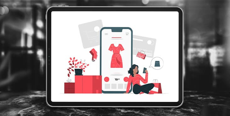
Five ways to improve your website mobile version
Google Italy has conducted A/B testing of changes to the mobile version of the Calzedonia Group sites. They did this as part of an experiment to improve conversions from mobile devices.
Despite the fact that mobile traffic in some stores reaches 80%, most orders are still made from a computer. Mobile technology specialists from Google decided to figure out why traffic from smartphones converts so badly and have been experimenting with the Calzedonia Group and Tezenis websites for more than a year. Their conversion from mobile traffic was 30-60%. Below we will talk about the changes that helped to increase the performance and maintain them steadily.
Highlight the main product categories
It's about the main page of the online store. It is important to show the main products that you offer on it. So the user enters the site and immediately sees part of the assortment. You can implement this in a slider format or in the form of pinned stories. Specifically, in the Google experiment example, the Tezenis mobile site increased conversion by 7%.

The main thing is that the images of product categories are legible. If you use too detailed photos or images of poor quality, they will be hard to see on smartphones. They do not need to take up most of the screen either. About a third of it is enough.
Add a search bar on the homepage
It would seem that this is an obvious thing, but everything is not so simple here. This is not only about the search icon in the form of a magnifying glass, which is located in the header of the site, but about the search bar. This innovation increased the conversion of sites up to 15%.
The explanation for the success of the search bar is that the user doesn't have to make an extra swipe to click on the icon in order for it to appear. If a person has a generated request and he thinks that you may have the right product, he will try to find it on the site. Separately, it is worth noting that those who use the search functions in online stores are more likely to make a purchase. The search bar is especially necessary for those sites that have a large range of products. This applies to clothing, sporting goods, construction products and furniture.
Add icons or images to the menu
Most often in an online store it is found that the sections in the menu are not graphically supported in any way. This is usually just a text title. But even this seemingly insignificant detail affects the conversion. When images were removed from the menu from the Calzedonia website as part of an experiment, conversions dropped by 5%.
The fact is that graphic elements are read faster. Therefore, icons and images help you navigate the site, including the menu. We recommend using icons, as they can be visually played with in different ways and, when properly designed, they are well readable on any screen.
Product description in a prominent place
Don't hide the product description. It should be in the most visible place next to the product photo. Some stores hide it under a button or link, but this is an unnecessary action that the user needs to take. Google's experiment showed that an open description adds about 3% to conversions. Even if the increase is insignificant, but on large volumes, these are tens or hundreds of missed orders.
Simplify the buying process
Make the buying process as simple and convenient as possible. A study showed that over 80% of the time, users abandon the cart at this stage. This is partly due to expensive shipping or comparing prices with other stores. But this also applies to the convenience of placing an order, filling in data and payment methods. The fewer steps and complications required for the purchase, the higher the chance that it will happen.
Conclusion
These simple changes can increase conversions from your mobile site by 10-20%. Don't be afraid to test other hypotheses as well. The main task of adapting the site is to simplify the life of the client. If your changes work in this direction, then most likely they will have a positive effect on the number of orders.
Get a free web development consultation
Tell us what you think
By clicking 'Submit', you agree to Privacy Policy and authorise our staff to contact you. You are liable under the Personal Data Protection Act if you key in false personal data or other people’s personal data.
offers and news
