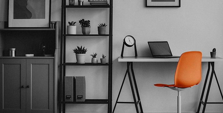
Minimalism in web design: why it works better when creating an online store
As technology advances and the world becomes more complex, minimalism and simplicity is an important advantage.
Let’s have a closer look at Google. Go to Google and you will see that it remains the easiest page on the web.
The minimalistic background made the company dominant in the search category. Google doesn't stuff its website with different designs, offers or pictures as many competitors do. Simplicity drives sales. You can apply this to your online store too.
Kill ads
For the website owners it’s better to decide if they want their visitors to focus on the shopping and making good sales or to distract users’ attention with ads and banners which give website owners an extra income. Here's a simple fact for you.
These things tend to annoy customers.
When people come to the website, they are focused on researching the assortment or a particular product in order to make a purchasing decision. Don't distract them to get a few pennies when you have the opportunity to make a serious profit from the sale of the main product. In addition, placing banners and pop-ups makes your site slower, leading to bounces and lost revenue.
Focus your homepage around a specific buyer action
The home screen is the area of your site that the user sees before scrolling. It is desirable to have information about only one thing on it. Focus on getting the client to find what they're looking for as quickly as possible.
It is especially important if you attract paid traffic (for example, contextual advertising), it is important that the client, by clicking the advertisement, gets to the page with a specific product, and not to the category as a whole.
If your home page looks simple, users will do what you want. If the site is littered with all sorts of information, then people will wonder what they should do, they will have to look around a bit, delve into it, figure it out ... If you are lucky, they will find what they were looking for and make a purchase.
If not, they will get frustrated and move to another site where they can find the product they need and buy it there.
Pictures are more than words
Our brain processes images much faster than text. When your site uses photos effectively, users stay in your store for a longer period of time. This is also a fact.
In addition, images are universal. Even if a person who does not speak the language, but is looking for a specific product, then good pictures will help him make a purchase.
Seven is your lucky number
Our short term memory can only store and remember seven elements. If you offer users more, be aware that you are frustrating them. The more options you give a person, the more likely it is to create indecision in the buyer.
A large selection makes people reluctant to buy, as they are looking for confirmation of their decision. Give customers too many options and they won't buy anything at all.
Drop dead weight
Monitoring your site's analytics will help you determine which buttons are being used and which ones are just taking up space. If you find links that aren't being used by visitors, just get rid of them. Why keep something that no one uses?
The same applies to goods. If a product on the main screen hangs from day to day and does not sell, then it is worth getting rid of it in order to give something else a chance to sell.
Think of screen space like shop windows and shelves. A well-known move by marketers is to display a more expensive or more popular product at the eye level of buyers. The same method applies to online stores.
These are just a few of the ways you can simplify your online store to drive sales.
The key takeaway is that the more complex your ecommerce site is, the less conversion you will see.
Minimalism in web design is as simple as that.
Get a creative brand asset as a bonus
Tell us what you think
By clicking 'Submit', you agree to Privacy Policy and authorise our staff to contact you. You are liable under the Personal Data Protection Act if you key in false personal data or other people’s personal data.
offers and news
