Top 3 web design trends of fall 2022
This month you will either love or hate the design trends presented. A common theme among them is a strong design element that can create clear emotional connections. They range from interesting solid color schemes to brutal examples to AI-inspired faces and design elements. Here's what's hot in design this fall.
1. Interesting solid color palettes
Monotone color palettes are not what we usually call a trendy design theme because monochrome patterns are almost always in style. What makes these monotonous websites interesting is the color choice.
The trend is to use rather unconventional color choices for solid color palettes. For example, would you start the design process thinking of all lilac, canary yellow, or purple?
For most designers, this is probably not the first choice. But on the contrary, the result of these decisions is quite stunning in each of the examples below, whether you like the color choice or not.
What works (and what might not work) with each of these trend examples:
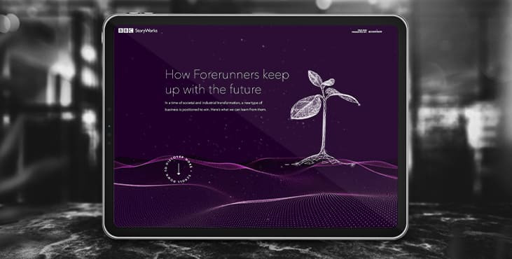
BBC Storyworks uses the dark purple color palette with pinkish highlights that is bright and readable despite the dark background. White text and elements with smooth animation emphasize the regal choice of color. The problem with this color is that purple often gives people strong emotional associations (good and bad) and you don't know what kind of associations users might bring to the design.
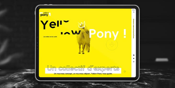
This yellow design is incredibly bright and has some brutal hues. What makes this color choice work is that it stops you in the way. You can't help but stare at the fancy colored bright yellow pony.
2. Pretty brutal black and white
Brutalism and the themes of brutalism in design seem to be constantly changing. Understandably, in general, designers can't decide what they think of this overall visual theme.
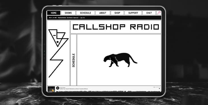
This rather brutal design combines not only absolute technique. It also has great black and white color schemes and animations.
Put it all together and the overall theme is arguably more "pretty brutal" than an outright brutalist, once again highlighting the swings in the trend.
What's great about this design is that it feels special and content-driven. This is a bit of a contrast to some of the other brutalist designs that are so harsh and harsh that it can be hard to know what you should be doing with the website or what information is most important.
Callshop Radio uses an almost magazine style theme, block design with large buttons, simple animation and a burst of color.
3. Futuristic faces
The latest trending design element this month is a fun take on faces. There is movement with a futuristic or AI/cyborg inspired take on the people depicted in the design.
It's hard to tell where this design inspiration comes from, but it's fun to look at as there are so many ways to play with this style. Another common feature is the dominant use of female faces.
These computer-generated images start out as photos that get brighter and smoother so that any imperfections disappear. There are no lines on faces, color may not look 100% natural, and enhanced features may or may not be realistic.
In many cases, you're not quite sure if you're looking at a video game face or an image.
The types of websites using this design trend are similar in content and fashion, art, games, portfolios and AI themes are some of the most popular. The true common thread is imagination. This type of design element cannot be realized without a clear vision and the ability to see the vision through creativity.
These examples use increasingly futuristic variations of the trend:
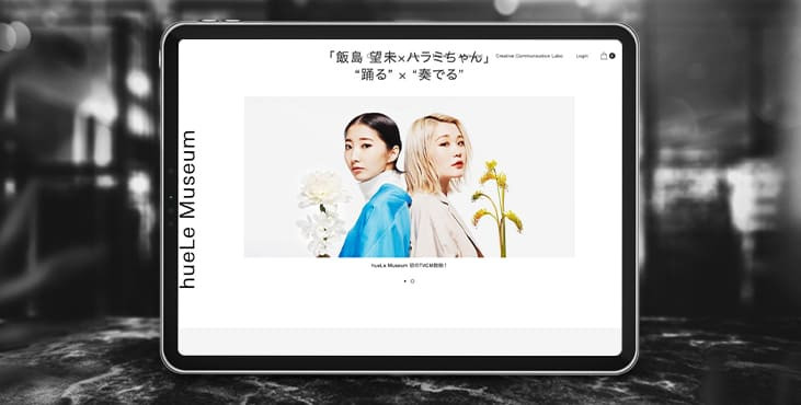
HueLe Museum. The least AI-like of the examples, has images with very bright lights on faces to remove lines and imperfections so that the models almost look like mannequins.
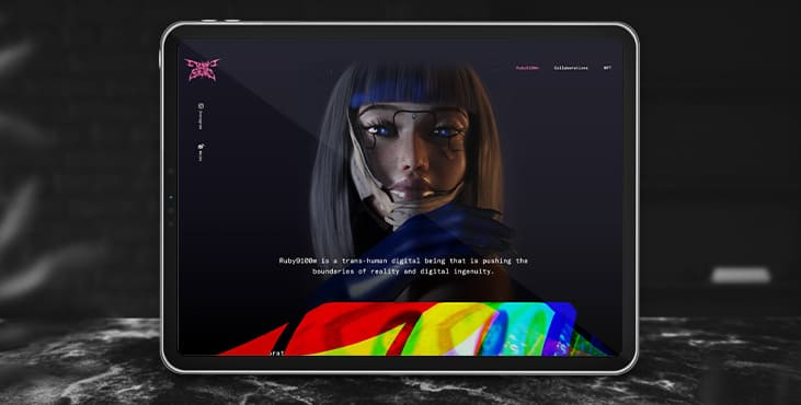
Ruby9100m. The images here are completely futuristic. Nothing in this image, from the coloring to the facial features to the almost cohesive image of Frankenstein, is true. (Did you notice the blue hand?)
Conclusion
This month's design trends are a lesson in experimentation and development of other visual concepts. They also have an immediate emotional impact on you thanks to the right choice of design.
These tendencies tend to come and go quickly; however, it will be interesting to see how they develop.
Get a creative brand asset as a bonus
Tell us what you think
By clicking 'Submit', you agree to Privacy Policy and authorise our staff to contact you. You are liable under the Personal Data Protection Act if you key in false personal data or other people’s personal data.
offers and news
