
Types of contrast in UI design
Contrast can be based on various features of user interface elements, including:
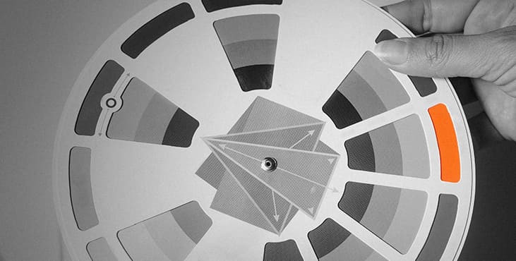
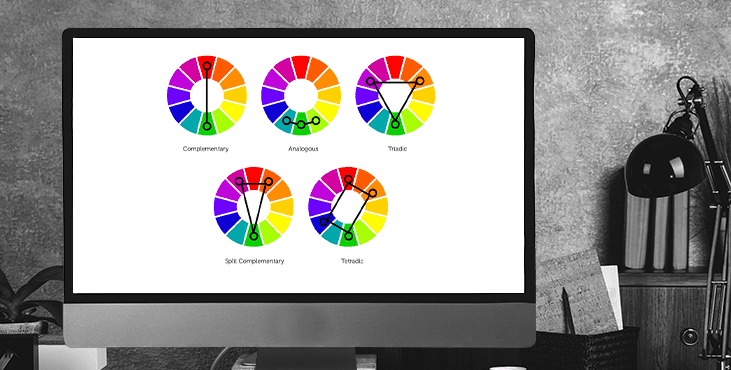
color: this type is one of the most natural and noticeable to the human eye; it works when colors are drastically different from each other, such as when combined with complementary, or triadic schemes (more on these can be found in our overview of color theory). This type of contrast is most widely used to make CTA buttons and other important navigation elements appear instantly in a web page layout or application screen that supports clear and intuitive navigation.
size : this type of contrast is based on making the element that should first attract attention noticeably larger than others
shape : here the attention of users is attracted by the fact that the shape of one element is different from the others.
position : in this type, designers change the position of one element on the line in a way that makes it different, like a new paragraph of a piece of text is indented.
texture: here the difference is built by using textures that are clearly distinct from each other
direction ( orientation ): this is where you change the physical location of the element, causing it to use different or unexpected directions, thus capturing the attention of users with an oddity.
The first thing that often comes to mind about contrast is something black and white. In the absence of shades and multiplicity of colors, a monochrome image uses contrast as the main enhancer of expressive potential. The same goes for user interfaces. Moreover, compared to works of art or photography, contrast not only affects aesthetics, but also has a significant impact on usability and layout navigation. Thus, the well-thought-out use of contrast is a powerful way to make websites and apps feel comfortable and easy to use.
Of course, this does not imply that interfaces in black and white are the only ones that work best. Being so restrictive would be foolish given the wide range of requirements and desires of individuals worldwide. Black-and-white testing is beneficial, though. Designers should be aware that different displays and resolutions might produce distinct visual effects with colored interfaces. Additionally, those who are color blind may find the interface challenging to utilize due to poor contrast.
Here are a few other factors to take into account when using contrast to the design of a web page or app screen.
Watch out for strong contrast if you plan to add text over the image.
Due to images' excellent capacity to fulfill a variety of purposes, image backdrops are a consistent trend in online and mobile design. As a result of this strategy, people are immediately drawn to the images on the screens, which makes them instructive as well as physically and emotionally appealing. Additionally, it preserves a sense of the coherence among all of the layout's components. To avoid the website becoming an unreadable muddle, which frequently occurs when the contrast is too low, it takes a lot of expertise and work to locate the proper contrast and merge the navigation and text content. Remember that a minimum contrast ratio of 4.5:1 is advised.
Too much contrast is exhausting and unsettling.
On the other hand, it's crucial to keep in mind that excessive contrast is also unnecessary and might really hurt some areas of user experience design. On pages intended to be viewed for extended periods of time and needing to take care not to strain readers' eyes, what effectively serves as an accent to immediately call attention to a button or a direction sign might actually cause real problems. Even when users of apps or website visitors are unable to clearly see what is wrong, excessive contrast makes them feel stressed and worn out and deters them from using a digital product.
Too much contrast means no contrast
In his book Design for Emotion, Aarron Walter shared a very valuable insight about contrast in user interfaces: “By increasing the number of high-contrast elements on a page, you proportionally increase the time it takes to complete a task, learn a system, and remember paths. Adding things pushes the human brain to the limit. Have you ever been to a party where everyone is screaming to talk to the person next to them? As the volume increases, everyone has to speak louder to be heard, but this makes the conversation even more difficult. Design works the same way. If everything demands the viewer's attention, nothing is heard." So, if you make a page or screen complex in this aspect and fill it with various elements that contrast with each other, the risk is high that the flow of interaction will become much more complicated, more annoying and less convenient.
Be mindful of negative space
Negative space (also known as white space) is the area of a layout that is left empty not only around objects, but also between and within them. Negative space is a kind of breathing space for all objects on a page or screen, so it greatly affects the effectiveness of the various types of contrast applied in the user interface.
Get a creative brand asset as a bonus
Tell us what you think
By clicking 'Submit', you agree to Privacy Policy and authorise our staff to contact you. You are liable under the Personal Data Protection Act if you key in false personal data or other people’s personal data.
offers and news