Typographic contrast in UI design
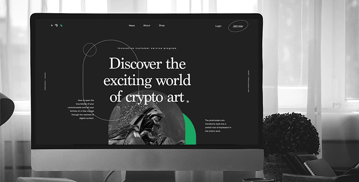
Typographic contrast is a specific type of contrast based on the difference in the distinctive features of the fonts used for the text part of the design.
Canadian typography designer Carl Dare identified 7 basic types of typographic contrast:
Size Contrast:
This is the physical increase in the main pattern created by the shape and the weight of the font used for the text. The most common case is to make the heading or title noticeably larger than the text.
Weight Contrast:
A bold font stands out from a lighter font of the same style. This helps draw attention to certain parts of the text and lets the user know their importance.
Form Contrast:
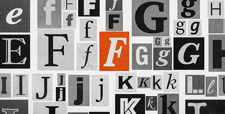
Form here means the difference between a capital letter and its lowercase equivalent, or a Latin letter and its italic variant, abbreviated and extended versions, font types that harmonize with standard types - all of the above can be used to dramatically change form. However, Carl Dare cautions against using fonts and cursive at the same time, as they are both versions of handwritten letters; they conflict rather than oppose.

Structural contrast:
Structure refers to the different letterforms of different typefaces, such as monoline sans-serif versus high-contrast modern, or italics versus black.
Texture Contrast:
This is about how the lines of a type look together as a whole, which depends partly on the letterforms themselves and partly on how they are arranged.
Color Contrast:
Here Dare mentions that the second color is usually less expressive than the primary black on white (or white on black), so it's important to think carefully about which element to highlight and pay attention to tonal values of colors used.
Direction Contrast:
This type is the opposite of vertical and horizontal and the angles between them. In addition, Dare points out that text blocks also have their own vertical or horizontal aspects, and mixing wide blocks of long lines with tall columns of short lines can provide contrast.
In addition, there are other, less popular types of contrast, for example, the so-called contrast by isolation, when one word or phrase is placed away from other elements, thus standing out from the crowd, as well as contrast in rhythm (gaps of space), parts where it is disturbed, set contrast and attract attention.
Availability of contrast
Reading all of the above, it's easy to assume that the rule of thumb here is the higher the contrast, the better the design. However, this is not true: like any other aspect of design, too much is not better. While low contrast makes content difficult to perceive and read, too high contrast causes eye strain, making interaction much more difficult. So, it's time to find the golden medium again.
The visual presentation of text and images of text must conform to a contrast ratio of at least 7:1, except in the following cases:
1. Large Text: Large text and images of large text have a contrast ratio of at least 4.5:1.
2. Random: Text or images of text that are part of an inactive UI component, are pure decoration, are not visible to anyone, or are part of an image that contains other meaningful visual content, do not require contrast.
3. Logos: Text that is part of a logo or brand name does not require a minimum contrast ratio.
Get a creative brand asset as a bonus
Tell us what you think
By clicking 'Submit', you agree to Privacy Policy and authorise our staff to contact you. You are liable under the Personal Data Protection Act if you key in false personal data or other people’s personal data.
offers and news
