What is an brand identity and how does it work in social networks
It is generally accepted that a brand identity is a set of different visual elements through which you recognize a brand. Fonts, a logo, a set of colors, all this is included in the brand identity, and with the help of all this you, for example, distinguish Apple from Samsung.
How is brand identity different from branding?
Let's first define the concepts, it is at this stage that the most confusion occurs.
We decided to open a coffee shop. Here is our coffee shop, our enterprise is a brand. We have a lot of ideas: how we will differ from competitors, what are our goals, what is our mission, for whom and what kind of coffee we will make so this is branding. Based on this, we come up with a name that will convey our character, choose a color palette and fonts, this is our packaging, it is also a brand identity.
What distinguishes a brand identity from a corporate identity?
You can complain here by saying, "But the corporate identity is the fonts, color scheme, and other graphics!
It's challenging to contest that. A company's identity is:
- trademark;
- color scheme;
- typefaces and design.
Corporate identity has the responsibility of communicating to the user the very ideas that went into creating the brand identity. Corporate identity is a tool for implementation if brand identity is a set of guidelines and procedures. Since the corporate identity is a part of the brand identity, anything that is contained in the corporate identity is also included in the brand identity.
What is included in the brand identity
Let's take a look at what is generally included in the brand identity, right on the points. Let's start with the basic elements.
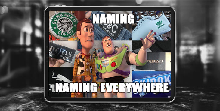
Naming
When a child is born, he is given a name. The word by which others will know him, with which he will be associated with everyone. Along with the word, of course, there will be connotations.

In our case, the child is the brand. We have already decided what it will be, what we want and how we want it. The task of naming as a component of the brand identity is to choose the very keyword or phrase that will stick to us once and for all and become the name and trademark.
It is not enough to come up with a sonorous or witty name, you also need to check that:
Conducted marketing research. Of course, it is important that the owner likes the name. But it is much more important that the name is okey to the target audience, responds in the heart and drags connotations useful for positioning and brand goals. Or at least not associated with something that, on the contrary, will alienate potential customers.
The name is unique. It will be embarrassing if you spend many months on planning meetings, stop at the only, the best option, morally grow together with it, and then it turns out that the name is already registered with another company.
Conducting market research without relying on data from social networks is difficult, expensive and impractical. The majority of consumers today use social networks. And not only use, but also find or sell goods directly through them.
Social media naming is the next step after the classic brand name. We design pages through which we will be found, and as we remember, contact with the user is the task of brand identity. Therefore, in the name of the profile and the public, it is often not enough to indicate brand name, it is also worth considering that the user understands where he is as early as possible.
Logo
This is the face of your business. Have you ever wondered why it is signs that are used on the roads, and not, say, the inscriptions “do not overtake”, “turn left”, “give way”? Because this is how we are arranged: a three-year-old child is unlikely to remember how to spell Apple, but show him two smartphones, tell him that with a bitten apple is an iPhone, and he will remember that the apple is an iPhone.
Think about how much information the logo carries. Moreover, this information is cumulative. The McDonald's logo may not tell you anything if you see it for the first time. And if you have already partaken of the most popular fast food seeing the legendary M, you will be filled with warm memories from childhood. And any french fries will always be compared with that potato. Only one letter, but how many associations!
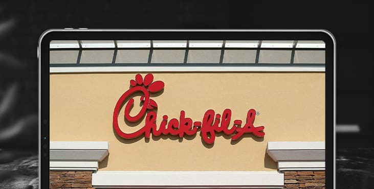
Another example is the American fast food chain Chick-fil-A. You may not know that it was they who invented the chicken sandwich, you may not even be aware that it is fast food. However, a superficial analysis of the logo is enough to understand that this is about food, it is unlikely that the vegan society for the protection of chicken rights is hiding behind the logo.

This is how the logo works, it carries the message, the energy of the brand, the first charge. And all subsequent contacts will only strengthen the connection and add color to the picture.
On social networks, your profile picture is your logo. It is important to consider that the size of the avatar is often tiny, so you need to remove all unnecessary and leave the very essence.
Color palette
If you have ever organized a renovation of your house, you know how important and difficult it is to choose colors. Perhaps Scandinavian minimalism is so popular precisely because it is easier to use solid white than to look for shades to suit your personality?
But this is how everything is arranged: in addition to explicit graphic and text elements, the chosen color also has meaning and message. The meaning always changes depending on the context. For example, a child enjoys wearing rainbow and color, and calms down in black and many rappers do the opposite. It's a joke, but it's all about the set of connotations: black is associated with both the Adidas tracksuit and the umbrellas in the cemetery. You may not even catch these connections in the form of formed thoughts, but unconsciously they will still line up.
When choosing a color, it is worth considering not only its characteristics, such as "orange - cheerful and positive", but also the marketing story. See which companies have already managed to use this color and eat into the mind of the consumer. For some, orange is Fanta, and for others it is Pixar.
Typography
The name, logo and colors are responsible for associative links and indirect semantic messages, while the company in any case will have to communicate with users in normal human language. Such communication takes place through text, and any text has some kind of spelling, that is, a font. Therefore, in the brand identity, it is imperative to think over what fonts, where and when the company will use.
Usually several fonts are selected. One is used in the logo and name, becomes the front and the most recognizable. Others make out text messages on banners and leaflets. Sometimes even headings have their own separate font. This whole set with the rules for its use is called typography.
Get an audit of your social media account as a bonus
Tell us what you think
By clicking 'Submit', you agree to Privacy Policy and authorise our staff to contact you. You are liable under the Personal Data Protection Act if you key in false personal data or other people’s personal data.
offers and news
