What is contrast in web design?
It would be impossible to define light if there were no darkness. It would be difficult to experience the refreshing pleasure of cold water if there was no warmth. It would be difficult to enjoy the sounds if there was no silence between them. It would be difficult to read the words if there were no empty spaces between them. We could not feel like adults if there were no children. Everything in the world exists and is perceived in contrast to something else, so it is not surprising that this is one of the foundations of art and design. And this is the topic for discussion in today's article.
What is contrast
In general terms, the word "contrast" is used to describe objects that are strikingly different from each other. Speaking of visual perception, contrast is mainly related to the difference in color or lighting, which allows you to clearly distinguish an object.
Why is contrast important? Because the human eye naturally picks up contrast. The maximum possible image contrast is called the contrast ratio or dynamic range. Moreover, for people with poor eyesight, visual impairments such as color blindness, contrast becomes the main characteristic of the objects they see and allows them to distinguish them.
In academic art, contrast deals with the arrangement of opposing elements and effects, such as light and dark colors, large and small shapes, and rough or smooth textures. In this case, contrast can be used not only to draw attention, but also to create mood and atmosphere, to create variety, visual interest, and drama in a work of art.
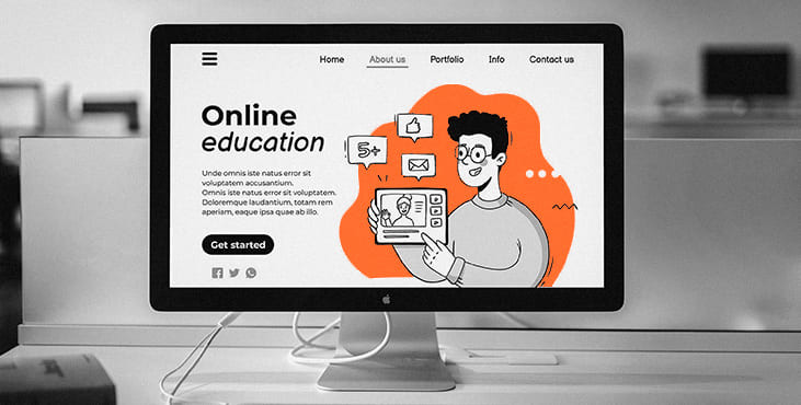
In design, contrast is one of the key factors affecting the crawlability and visual hierarchy of a web page or mobile screen. This allows the designer to present the layout in a way that informs users which touchpoints are vital and which are secondary. Contrast effectively captures the user's attention and draws them to certain elements, so it plays a big role in supporting the intuitive navigation and usability of a digital product.
Why Contrast Matters
To summarize everything mentioned above, let's define a few key benefits of contrast as a powerful tool for good usable design:
- stronger visual hierarchy
- better focus
- originality
- improved readability
- conformity with natural human perception and reaction
Life is full of contrasts, no matter what facets you are. Throughout life, we must learn to accept this and try to enjoy life, which is so varied and unpredictable. Echoing reality, the design is also full of contrasts and makes the most of them.
Get a creative brand asset as a bonus
Tell us what you think
By clicking 'Submit', you agree to Privacy Policy and authorise our staff to contact you. You are liable under the Personal Data Protection Act if you key in false personal data or other people’s personal data.
offers and news
