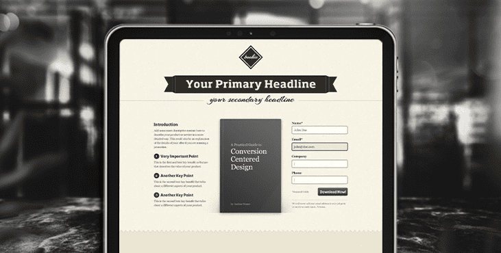
What is conversion centered design?
Conversion Centered Design (CCD) is a discipline aimed at solving one specific business problem. The main principle is to guide the visitor on the path to one specific action, using persuasive design and psychological triggers as tools that increase conversion rate.
The most striking example of the use of CCD are the so-called landing pages. All of you have already come across such single page sales websites more than once. They either sell something, or collect subscribers for some free present, or gather people for the next webinar, etc.
There is nothing superfluous here. Everything is aimed at solving one single task to bring the visitor to the finish line. And the faster and more accurate, the better.
7 Conversion centered design principles
1. Isolation is a classic technique used to capture the attention of your visitors and create a tunnel vision effect. You can think of this as a window on the landing page that contains your cherished call to action (CTA) button.
2. Contrast and color. Those who argue about the importance of a particular button color are mistaken. It's not the color that matters, it's the contrast. If the entire landing page is decided in green tones, then the green button on it will simply be lost. Use a contrasting color, such as red. The example is very rude, but the principle, I think, is clear.

3. Directed hints. Draw the attention of the visitor to the main details of the landing page using arrows or unusual arrangement of elements, leading the eye to a single goal, the call to action button.
By the way, a very good technique is the direction of gaze, whether it is a person or an animal depicted in the picture. Instinctively, we look in the same direction as they.
5. Empty space. Leave enough white space, so-called "air", on the landing page. This will make it calmer and highlight the call to action button.
6. Relevance and scarcity. These are general psychological factors of motivation, familiar to many. The main features are urgency (limited supply time) and scarcity (limited supply).
7. Try before you buy. Offering to try your product before buying, you appear confident in your product. This increases trust and is an important factor in increasing conversions.
8. Social proof. Not the best definition, but what it is. Simply put, this is a collection of statistics on a specific group of people who have already used a given product or service. Here the principle “I want it too!” works, because statistics are naturally credible.
Practical application of conversion design
Let's take a look at the principles of conversion design using the example of one landing page. In this case, the page offers a free download of an e-book in exchange for the visitor's data: first name, last name, and email address.

Get a creative brand asset as a bonus
Tell us what you think
By clicking 'Submit', you agree to Privacy Policy and authorise our staff to contact you. You are liable under the Personal Data Protection Act if you key in false personal data or other people’s personal data.
offers and news
